Original YP
Spring 2023
Enriching users' search journey to better connect them with relevant results and customers.
I'm focused on building experiences that are engaging and meaningful. I've worked within a variety of roles and teams making interactions more intuitive, empowering, and enjoyable for thousands of people.
While my passion is UX, I'm also experienced in coding front and back-ends to implement designs and features, organizing marketing campaigns and the content to support them, and building data-driven systems that have doubled KPIs and shaped company-wide decisions.
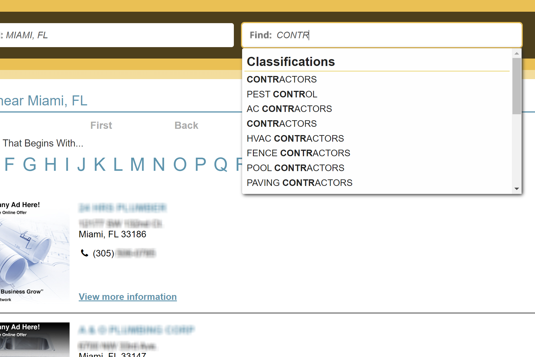
Spring 2023
Enriching users' search journey to better connect them with relevant results and customers.
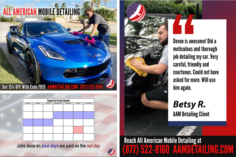
2021
Content I made at AAMD for social media, recruitment, and customer retention marketing purposes.